| The Control Chart Panel |
This component uses data from the bead board to plot control charts. It can also be used to plot charts manually.
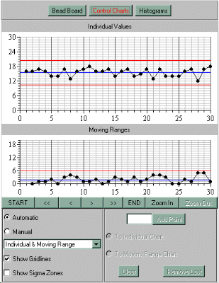
As you can see from the image above, the main area at the top is where the charts are plotted, and the controls for the charts are located at the bottom of the panel.
There are three chart types which can be plotted, each of which has two elements:
The three types of chart are:
The first two charts are for use with subgroup data. Both of these charts should provide the same information, although the range chart will look different from the standard deviation chart. They are both included to illustrate the different ways in which data can be presented, not because they reveal different things about the data.
The Individuals chart is for use in cases where it is impossible to create logical subgroups for the output of a process. Therefore, when the individual and moving range chart is selected, the information from the board is treated as the total number of individual beads, and all subgroup data is ignored. Individuals charts are also useful in setting the process aim. This is covered in one of the exercises.
Note about the use of XmR Charts in real-world situations: When you use an XmR chart to monitor a real-world process, a value which is close to one of the natural process limits being immediately followed by a value which is close to the other limit is an indication of the presence of an assignable cause. Although both values may be within the process limits, the sudden shift between consecutive values represents a marked change in the ouput of the process. As such, it will show up on the moving range chart as an out of control point.
Because the bead board simulation is entirely random, in that there is no relationship between the value for one bead and the next, such sudden shifts are quite likely to occur with far greater regularity than in a real-world situation. Thus, there is a good chance that in any simulation you run, one or more of the points on the moving range chart will show up as out of control. Don't worry about this, it does not mean that the limits have been set incorrectly, it is simply a product of the artificial nature of the simulation.
Note about Manual Plotting: Because a set of values will be valid for one chart type only, switching between chart types when manual entry is selected will wipe out any points entered so far. If you switch between manual and automatic charts, the program will look for a valid set of values for the current chart type and will display them if it finds any. If there are manual values stored for a particular chart type, but you select manual plotting with the chart type set to a different type, the stored values will be erased.
The controls for the charts have the following functions:
The Scroll and Zoom Buttons
Start
This button scrolls the charts back to the beginning.
Page Back (<<)
This scrolls the charts back the width of one page (i.e. 30 points).
Nudge Back (<)
This scrolls the charts back 5 points.
Nudge Forward (>)
This scrolls the charts forwards 5 points, (if there are more points
beyond the last point currently being displayed).
Page Forward (>>)
This scrolls the charts forwards one page, or to the end if there are
less than 30 more points to show.
End
This scrolls the charts to the end.
Zoom In
This button makes the charts display an enlarged view of the area
within the control limits. Out of control points may disappear off the
charts when they are zoomed.
Zoom Out
This button reverts the charts to their normal view.
The Left Panel
Manual / Automatic Checkboxes
Use these to select whether or not the charts are plotted automatically
each time a simulation is completed. If 'Automatic' is selected, then there
must be valid data available from the bead board. Each time the board is
reset, the charts will be cleared until new data become available.
Chart Type Choice Box
This is a drop down box which allows you to choose the current chart
type. Click on the button at the right hand end to display a list of the
available charts, and then select the chart type you require.
Show Gridlines
Click this box to turn the background grids on the charts on and off.
Show Control Limits
This box shows or hides the control limits and the centre lines for
the charts. This is used mainly in the guided exercises, but you can use
it if you wish to view data in the form of a simple run-chart, with no
lines drawn on.
Show Sigma Zones
By default, the charts only display the centre line and the upper and
lower limits. If this box is checked, lines will be added at one sigma and
two distance above and below the centre line. This is useful for using
some of the more advanced detection rules, and particularly when setting
the process aim.
Individual sigma zones can only be shown when the control limits are showing. If the control limits are turned off, the sigma lines will be removed and the checkbox will be disabled until the control limits are turned back on.
Manual Entry Controls
These controls are disabled when automatic chart plotting is selected (as shown in the image at the top of the page). When they are enabled they look like this:
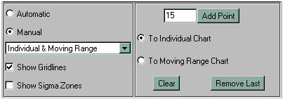
Add Point Field / Button
Type a number in the field and press ENTER, or click the ADD POINT
button and the point will be plotted on the currently selected chart.
'Add To...Chart' Checkboxes
Depending on which of these is selected, the operations will be
perfomred on either the location chart (the upper chart), or the
dispersion chart (the lower chart). The currently selected chart will
be the target for ADD POINT, REMOVE LAST, and CLEAR.
Clear
This will clear all points from the currently selected chart.
Remove Last
This removes the last point that was added to the currently selected chart.
| UP: The Bead Board Applet | NEXT: The Histogram Panel | BACK: The Board Panel |