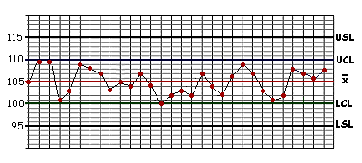
| Key: | |
| USL = Upper Specification Limit | UCL = Upper Control Limit |
| LSL = Lower Specification Limit | LCL = Lower Control Limit |
The patterns created by the plots marked on a completed control chart can tell us a great deal about the process which is being monitored.

| Key: | |
| USL = Upper Specification Limit | UCL = Upper Control Limit |
| LSL = Lower Specification Limit | LCL = Lower Control Limit |
For example, this graph from an Individual and Moving Range Control Chart shows that the natural limits (i.e. the area between the Upper and Lower Control Limits) of the process for producing the steel beams lie between 100 and 110cm.
The control limits (100-110cm) are much narrower than the specification limits (95-115cm). This tells us that virtually every beam produced by this process will meet the customer's specification without difficulty, as long as the process remains in a state of statistical control. In fact, statistical probability actually predicts that 99.7% of the beams will fall within these control limits.