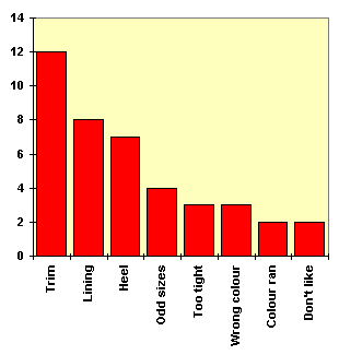
To make the situation clear to her Area Manager (who had encouraged her to stock the shoes), Julie decided to transfer the data to a Pareto Chart.
This is basically a bar chart where the largest value is entered on the left, with the others in descending order to the right. We will look at Pareto charts in more detail in the section on Pareto Analysis.