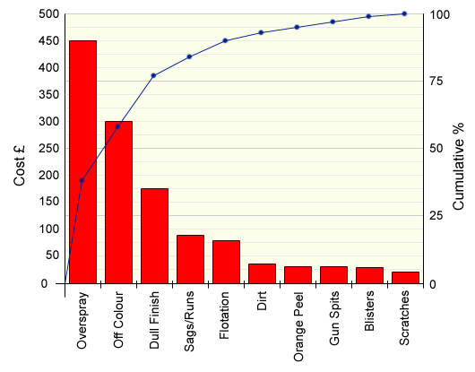
Your revised chart should look like this:

Comparing this chart with your previous one, you can see that there are some significant differences when costs are considered rather than simply frequency. This sort of analysis should lead to better allocation of resources for impmrovement activities.