|
1) Selecting the correct control chart.
There are many types of control chart. The type of data being collected will determine
the chart to used. Use this diagram to select the correct chart for the situation.
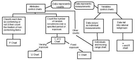
All of the various control charts are similar in appearance and structure.
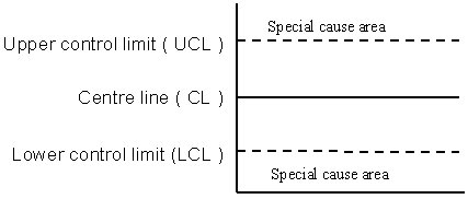 |
Certain predetermined patterns inside the
control limits also indicate special causes |
2) Control charts for Variables
The charts for variables described in these guidelines are;
- Mean and range (
 & R ) preferred for most manual applications. & R ) preferred for most manual applications.
- Median and range (
 & R ) the most simple. & R ) the most simple.
These charts are used in pairs, one to monitor process and the other to
monitor variability.
2.1) Sample selection
- A sample size of 5 has been found to give reliable results, and is commonly
used for & R and & R charts.
Sample sizes must stay consistent for any one chart.
20 - 25 groups of samples are required before calculating control limits and
statistics.
- Samples should be taken periodically at regular intervals to provide a
picture that relates to all aspects of the process. To prevent 'regularity'
introducing a bias to the data collected, the collection frequency could be
about, every 200 produced, about every hour or four times a shift or so on.
- Samples should capture the effects of process disturbances such as start up,
tool changes, shut down and shift changes.
- The units in a sample should have been produced consecutively. Samples
of consecutive units will give a better idea of process disturbances than
samples chosen randomly.
2.2) Special circumstances
- The purpose of charting is to develop a picture of process variability and
setting. It is wise to do this as quickly, and economically as possible.
( The guide lines for sample selection allow room to manoeuvre.)
For the first chart, 125 consecutive units might be taken, and treated as if
they were 25 samples of 5.
- The data might reflect a single run with no disturbances, such as tool
changes, start ups or stops. The resulting chart probably not reflect the true
behaviour of the process, but it will be better than no chart at all, and give a
starting point for identifying process improvements and special causes which
occur.
- As time passes and more charts are generated, the picture will become
clearer, and problems will be more easily identified.
2.3) Process changes
- Generally, process changes will show clearly on a chart. When ever there is a
change, the chart control lines will need to be recalculated.
- Recalculating of controls should be recalculated once the data from 20 samples has been
collected following the change.
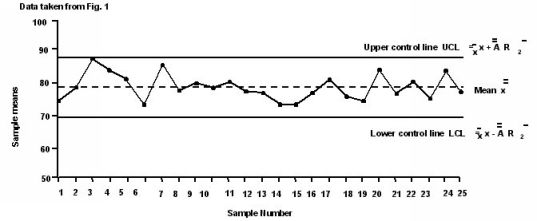
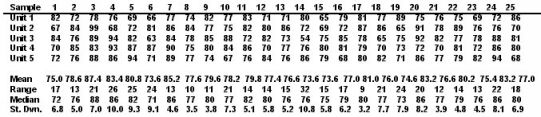
3) Mean and Range Chart ( & R )
4) Median and Range Chart ( & R )
Figure 4
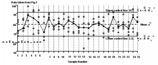
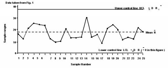
- The ranges graph is the same as the & R chart. ( see Figure 3 )
- The medians graph will detect changes in the process mean, but will not
estimate the process mean.
- When the actual value of the mean is important, more useful information will
be obtained from & R charts.
The differences between the chart and the chart
- Measurements of the units in a sample are recorded only as plots in a vertical
line on the chart ( Figure 4 ) rather than written numbers.
- The median ( or middle ) value for each sample is highlighted on the chart, if
there an even number of units in the sample, the highlight is placed between
the two middle values. Lines are then drawn to join the medians.
This is instead of calculating, plotting and joining the means, as on a chart.
- Control lines are calculated from
 ( the mean of the sample medians ) and R,
using the formula shown in Figure 4. The constants A, D and D depend on
the size of the sample ( see Constant Table, Figure 5 ).
NOTE: A is used for medians charts and A for means charts. ( the mean of the sample medians ) and R,
using the formula shown in Figure 4. The constants A, D and D depend on
the size of the sample ( see Constant Table, Figure 5 ).
NOTE: A is used for medians charts and A for means charts.
- Control lines for medians are about 25% further apart than those for means,
but this does not have any practical significance.
|
Figure 5
Table of Constants
The data shown is for the & R and & R charts.
|
Sample Size
n |
A2 |
~
A2 |
D3 |
D4 |
| 2 | 1.880 | 1.880 | 0 | 3.267 |
| 3 | 1.023 | 1.187 | 0 | 2.574 |
| 4 | 0.729 | 0.796 | 0 | 2.282 |
| 5 | 0.577 | 0.691 | 0 | 2.114 |
| 6 | 0.493 | 0.548 | 0 | 2.004 |
| 7 | 0.419 | 0.508 | 0.076 | 1.924 |
| 8 | 0.373 | 0.433 | 0136 | 1.864 |
| 9 | 0.337 | 0.412 | 0.184 | 1.816 |
| 10 | 0.308 | 0.362 | 0.223 | 1.77 |
| 11 | 0.285 | | 0.256 | 1.744 |
| 12 | 0.266 | | 0.283 | 1.717 |
| 13 | 0.249 | | 0.307 | 1.693 |
| 14 | 0.235 | | 0.328 | 1.672 |
| 15 | 0.223 | | 0.347 | 1.635 |
| 16 | 0.121 | | 0.363 | 1.637 |
| 17 | 0.203 | | 0.378 | 1.622 |
| 18 | 0.194 | | 0.391 | 1.608 |
| 19 | 0.187 | | 0.403 | 1.597 |
| 20 | 0.180 | | 0.415 | 1.585 |
| 21 | 0.173 | | 0.425 | 1.575 |
| 22 | 0.167 | | 0.434 | 1.566 |
| 23 | 0.162 | | 0.443 | 1.557 |
| 24 | 0.157 | | 0.451 | 1.548 |
| 25 | 0.153 | | 0.459 | 1.541 |
|
|