Purpose
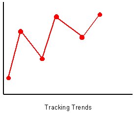
Run charts are used to examine data for trends or other patterns that occur over time.
Detection of these time related shifts is an essential step in making long lasting
improvements.
How does it work ?
- Monitors the performance of an activity or process over time to determine trends.
- Compares performance before and after the implementation of an improvement action.
- Gives a focus to vital changes in the process.
Method
- Create the graph, with the vertical ( y axis ) line being used for the scale related to
the variable being measured and the horizontal ( x axis ) line used for the time scale.
- Plot the data.
- Interpreting the data.
- Obvious trends will be easy to spot.
- If there is no obvious trend, an average line may be used. Calculate the sum
of the measured values and divide by the number of data points. ( This will give
the mean value.) Draw a horizontal line at the average value.
- Is the average line where it should be ? ( note; do not re-draw the average line
every time new data is added. Only when a change in conditions occurs should
the average be re-calculated, and then using the data points after the change.)
|