Purpose
A histogram is used to summarise data that has been collected over a period of
time, and graphically present its frequency distribution. It is mainly used where
large amounts of data are involved which would be difficult to interpret in tabular
form.
How does it work ?
- Shows the relative frequency of occurrence of the various data values.
- Illustrates the underlying distribution of the data.
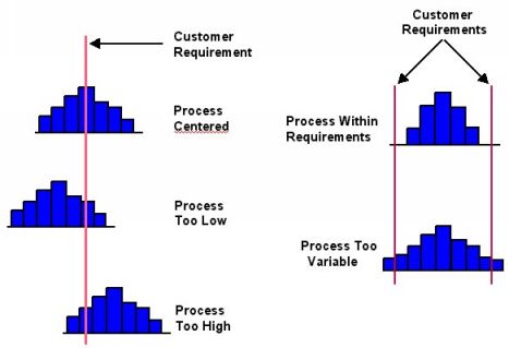
- Helps to indicate if there has been a change in the process.
- Helps to answer the question "Is the process capable of meeting the customer's
requirements."
Method
1)The data should be variable data, i.e. data that is
measured on a continuous scale, for example, dimensions.
2)50 to 100 data points are required in order to be able
to identify patterns, the mean and variation.
3) Construct a frequency table from the data.
Example: Fifty Gap Measurements
| 45 | 59 | 54 | 43 | 33 | 69 | 39 | 58 | 58 | 47 |
| 53 | 55 | 31 | 53 | 56 | 48 | 58 | 62 | 51 | 67 |
| 59 | 45 | 53 | 60 | 45 | 41 | 42 | 66 | 56 | 76 |
| 69 | 67 | 43 | 36 | 56 | 62 | 56 | 64 | 48 | 79 |
| 64 | 49 | 71 | 83 | 63 | 56 | 60 | 63 | 49 | 50 |
4) Grouping to produce a tally chart
- The minimum measurement is 31, the maximum is 83, and all the
measurements are whole numbers. This gives a possibility of 52 categories.
- A convenient group size is 5 units, which gives 11 groups in the range
30 to 84.
- A more scientific method of calculating the number of groups:
Take the square root of the total number of data points and round to the
nearest whole number. For this example assume an odd number of recordings.
k = 125 = 11.18 = 11 k = Number of groups
- The number of intervals can influence the pattern of the sample. Too many will
produce a flat, spread out pattern. Too few will produce a high, tight pattern.
| Groups | Tally | Frequency |
| 30 - 34 | // | 2 |
| 35 - 39 | // | 2 |
| 40 - 44 | //// | 4 |
| 45 - 49 | ///// /// | 8 |
| 50 - 54 | ///// / | 6 |
| 55 - 59 | ///// ///// / | 11 |
| 60 - 64 | ///// /// | 8 |
| 65 - 69 | ///// | 5 |
| 70 - 74 | / | 1 |
| 75 - 79 | // | 2 |
| 80 - 84 | / | 1 |
5) With variables it is important to have a clear cut-off between groups, so there
is no doubt to which group a particular measurement belongs.Grouping will
always result in a slight loss of information, although this is usually more than
offset by a better understanding of process variability.
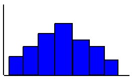
6) Drawing the Histogram from the tally chart.
- The vertical scale (y axis) represents the frequency scale. Draw this long
enough to cover the class interval with the highest frequency count.
- The horizontal scale (x axis) represents the variable being measured.
- For each class interval, draw a bar with the height equal to the frequency
tally of that class.
7) Drawn Histogram

8) Interpreting the Histogram
|