Purpose How does it work ?
Method 1) To test a theory, collect 50 - 100 samples of data that you think may be related, then construct a data sheet. Theory: There may be a relationship between coating thickness and dip time.
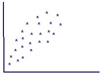
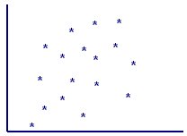
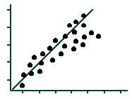
2) Draw the axis lines of the diagram, using the vertical axis for the dependent variable, or the 'effect', and the horizontal axis for the independent variable, or cause. Then plot the data. 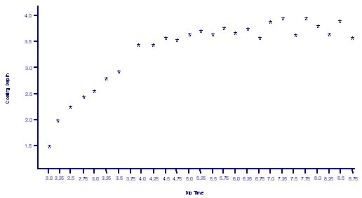 3) Interpret the results. The results shown in the example identify that dip time has an effect on coating depth, but only up to a point. From 2 minutes to to 3.75 minutes, the coating depth increases steadily. At 4 minutes there is a rapid increase in depth, but after this period of time, the application of the coating becomes erratic with very little increase in depth. This result is described as a positive correlation as it shows that an increase in time can affect the coating depth. 4) Other types of results.
|