)
In the previous section, How to Plot an Individual & Moving Range Chart, we looked at the way you calculate and plot points on the two graphs on an XmR chart. In this section we will be looking at the way you calculate and add control limits to each graph.
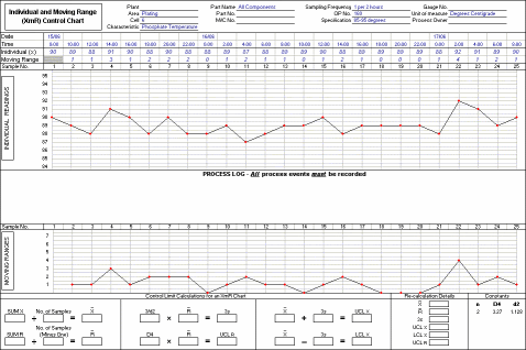
The image below shows a chart that has 25 individual values recorded on it. In this exercise, we will be using these values to calculate control limits for the process. You will need to print out a copy of the chart to work on during the exercise.