Throughout this exercise, we have been working on graphs without control limits. As noted at the beginning, control limits calculated from historical data would normally be added to the chart when it is first prepared for use. However, since this is a new process, there was no data available from which to calculate control limits.
A control chart without control limits is obviously of limited use, so it is desirable to add limits to the charts as soon as possible. It is normally reckoned that 25-30 samples are required to calculate reliable control limits for a process. However, it is statistically valid to calculate trial limits based on only a few samples, with the understanding that they will be revised when an appropriate number of samples have been recorded. This is particularly useful for processes, such as this one, where it may be weeks or even months before 25 samples are recorded.
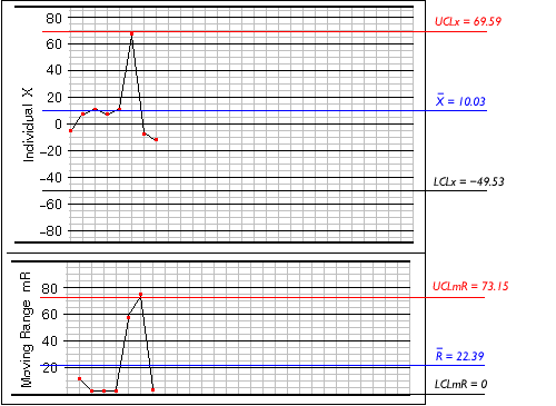
The image above shows the trial limits calculated from the first 8 samples. Looking at the range graph, you can see that there is one point above the upper control limit; this is a clear signal that the process is not in control. This means that the average range, used to calculate the other control limits, will most likely be artificially enlarged. Consequently the X-graph for individual values has control limits that are much wider than they should be, so no points appear outside the limits. In this situation the limits would be recalculated using a different method, to compensate for the artificially enlarged range.