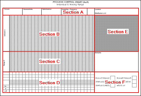
The XmR Chart is a variant of the Mean & Range Chart, which was discussed in the previous module of the course. It is used in situations where:
The image below shows an example of a blank XmR Chart. Click on each of the labelled areas in the image for more information about that section of the chart.