In the previous section, How to Plot a Mean & Range Chart,
we looked at the way you calculate and plot points on the two graphs on
an ![]() & R chart. In this section we will be looking
at the way you calculate and add control limits to each graph.
& R chart. In this section we will be looking
at the way you calculate and add control limits to each graph.
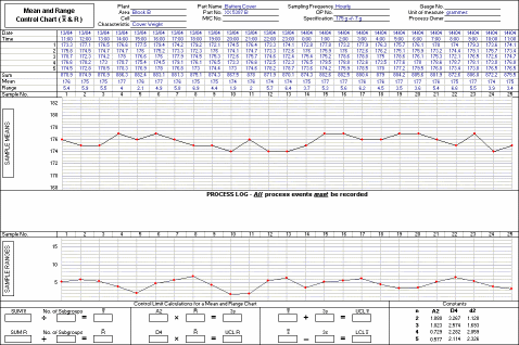
In this exercise, we will be using data from the same battery cover process as in the previous one. A special cause was identified and removed from the process, which means that it is necessary to recalculate the limits. Data for 25 subgroups has been collected and plotted on a blank chart as you can see below, and we will be using these values to calculate the revised control limits. You will need to print out a copy of the chart to work on during the exercise.
)