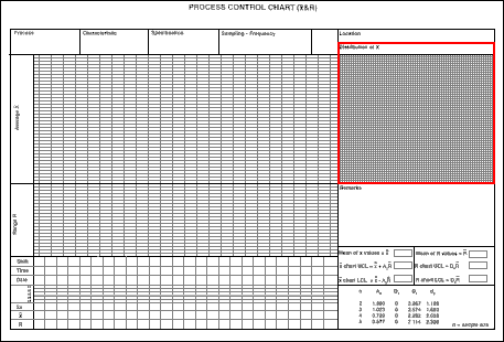
The image below is another Mean & Range Chart. It has the same basic elements as the previous one but it is set out in a slightly different way. In addition, it incorporates a graph (highlighted on the image below) on which the distribution of x can be plotted. Thus the value of every item in every sample can be shown in "plot" form.
This distribution of x graph is very useful in indicating the basic structure of data: e.g. whether it is a Normal or skewed distribution. And it will show clearly if there is any change in this distribution.