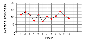
Now look at the same data presented in a very different format. The run chart below shows the average thickness of the sockets sampled at each hour. The average is calculated by adding up the values for each sample and then dividing by the number of samples. This is the format most commonly used on control charts to display information about a process.
We think you'll agree, most people would find the chart far more informative than the table: a picture paints a thousand words!