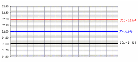
Control Charts
The image below shows the control limits as they appear on a process
control chart. In this case, the example is a mean graph from a
mean and range chart.
You can see that 3 lines have been drawn on the chart:
- In the middle (drawn in blue) is the mean, labelled
 .
.
- At 3 sigma above the mean is the upper
control limit (drawn in red and labelled UCL)
- At 3 sigma below the mean is the lower control
limit (drawn in black and labelled LCL)