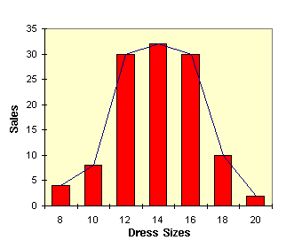
As you can see from the bar chart shown above, by far the most popular sizes were 12, 14 and 16, and the central one is size 14. If we take this value to represent the mean, and we put a vertical line through the middle of that column on the graph, we would see that the data is fairly evenly distributed on either side of this central line.
Drawing a line over the top edges of each of the bars to connect them all produces a rough bell-shape. This bell-shaped curve is characteristic of the normal distribution.