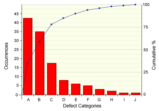
The basic structure of a Pareto Chart is a combination of two of the charts introduced in the section on presenting data. First of all there is a bar chart which shows the number of occurrences of each characteristic being observed. However, unlike other bar charts, the characteristics are arranged in descending order of frequency from left to right. The second element is an ogive which shows the cumulative percentage (or sometimes the cumulative frequency) of the characteristics.
Looking at the chart above, we can see that problems A and B occur far more frequently than any others, and that A, B and C between them account for almost 80% of all defects.
On the face of it, then, it would seem that problems A and B are the most serious and should be tackled immediately, closely followed by C. As you will see later on, this may not be the best course of action, however, as simply the number of occurrences may not tell the whole story.
We will now work through the development of a Pareto Chart to explore the principle further.